How To Create A Functional Corporate Website Design Interface?

It doesn’t matter in which industry we operate – a company website is always a good solution. Only 15 years ago, hardly anyone took websites seriously, now they have become the obvious standard. A company website design should have two basic functions. First of all, it should be our showcase and meet the company’s PR assumptions. Secondly, it should present products or services that a given company deals with. So how can we design a functional interface for the company website?
When designing the company’s website interface, we must ask ourselves the key question: “What will the user visit our website for? In turn, if the goal of our site is to offer a service or sale of a product, we should focus specifically on the ‘products’ and ‘services’ pages.
Colors
The colors and style of our site will largely reflect our company. If we work in a corporation or bank, our company website should be very formal and minimalistic. You can easily use such a combination of colors like white with blue or white with red. For start-ups and modern industries, we can experiment with colors. Lots of greenery will bring a breath of freshness and energy, while black and white are associated with advanced formalities. Remember that the color of the company website must be consistent with the logotype and visual identity of the brand. Think about what colors should communicate on the site and how they can express goodwill.
Creativity and minimalism
Innovation and lack of schematicity are not always effective when designing the company’s website interface. Modern UI (user interface) designs can arouse a sense of alienation in the user and simply scare him away. Sometimes it is better to use proven and tested solutions, e.g. it is not worth changing the location of the login panel since most users associate it with the upper right corner of the page.
The logo of your company should be placed in the upper left part of the page, or skillfully weave them into the very center of the website, and information about contact and availability should be located in the upper and lower part of the page.
Pictures
If you want to introduce your team or company management, do not use photos from a free or paid website with photos for this! This is the shortest way to tear down the company’s authenticity and image. If you want to introduce your team, then use real, professional high-resolution photos. When placing photos on the page, make sure that they match the style of the interface of our company page.
Use icons
It is said that a photo or symbol can describe more than a thousand words. It is not without reason that we associate the chat bubble with comments, the envelope reminds us of emails, and the heart with adding something to favorites. The skillful use of icons will significantly improve the interface of our company website and make it possible for the user to navigate efficiently.


Company website content
We live in a time where people have neither the desire nor the time to read the content of a website from cover to cover. Instead of describing the assets or achievements of your company, try to present them in a more user-friendly form – e.g. using graphics and photos or a short video.
When creating content for your company website, remember not to make it too long – try to describe the most important aspects in a few short sentences. More and more often we are dealing with the phenomenon of ‘scanning’ a website. The user scrolls the entire page and reads only the ‘most interesting’ content according to him.
Realizations and experience
It is worth devoting one subpage to presenting the projects implemented by the company and your portfolio. In this kind of subpage, we can easily put the logos of our partners and customers.
A great solution is also to describe the scope of services provided, the duration of the project, and add customer feedback. The ‘implementations’ tab is a great way to present your company’s competences, so don’t limit your creativity!
Information about the company
Do not forget about the most important adding such subpages as “About us”, “Contact” or “Team”. These will be the main ‘pillars’ of our site, where users will have the opportunity to learn detailed information about the brand we present. An interesting accent is also the timeline showing the company’s history over the past years.
On the “About Us” page you can include information about the company’s history, year of foundation, and current composition of the board. It is also a good place to boast of achievements as well as certificates and diplomas. For large companies, the “Team” tab is mainly used for a general description of company employees. If your team is only a dozen or so people, then you can describe each employee and his function individually. It will allow the user to get used to the atmosphere and culture of our company. The “Contact” tab must contain key information, such as contact number, company address, email address, and fax.
The solution lies in simplicity
The page must be simple and logical. The user has no right to think about what you are trying to communicate with him. The company website should contain only content related to the company and its achievements. Deviating from the topic may mislead the user, which will result in a quick exit from the site and an inevitable disappointment.
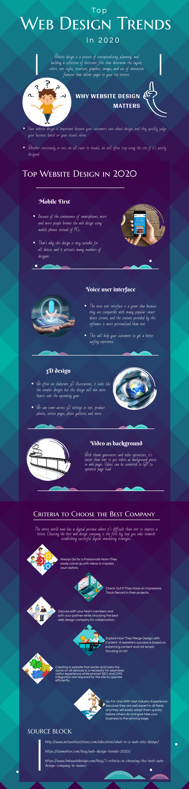
Infographic